Evaluation
For this assignment we was allowed to pick a unique topic of
our liking, therefore we was allowed to choose anything for the Final major project we had to
create more than one final piece, I firstly created a brainstorm idea where I
got many ideas for my final project, one idea I was thinking of doing was a
t-shirt design, but then I realized it was too mainstream, therefore instead I
chose to do something different which was to design two video game covers which
consisted of a good and bad character and a poster to go with it, the platform
for my game I chose was (Xbox one) because Xbox games are one of the most
popular selling. I firstly created a schedule which helped me out on when
and how long I got left to finish my project.
Furthermore for my research I had to go into shops and take images of the games covers to get ideas, The games that I researched was Assassins Creed : Syndicate, Fallout 4, Star wars : Battlefront and Tom Clancys : The Division. I researched into their masks, characters and the backgrounds of them. Moreover I researched different masks online, for my evil character, and I chose to persue one of the masks shape but change it when editing. I done the same for my good character, I researched masks for the character and I got ideas of shapes for my mask. Also I researched game developers such as Activision and Bethesda and discussed the games they have created.For further research, I went to NCN Adams library and got ideas from the books Michael Stratczynki, J (2007). Thor vol 3. Us: Marvel. And Miller, M (2005). The Ultimates Vol 2. Us: Marvel. These books helped me with colours and textures for my masks which I was going to include on my game covers. I also created a Survey Monkey where I asked members of the public questions. I chose to make the target audience 16 + this is so I have a mature audience also due to the masks designs, you can see this in my Mask research (evil characters) blog''. Also it is for any sex and it is for everyone it is also affordable for the average person so everyone is able to purchase this game no matter their income.
Moreover I started to take images of buildings for my background on my video game covers to do this I went to Sky-gardens In London and took my photography there, after that I created three contact sheets.I also discussed which Images I was going to use and wasn’t going to use I believe my photography went well because I used different ISO settings throughout the main ISO settings I used was 100, 200 and 300 this is because the lighting levels changed throughout the day in addition I have used an aperture of F16 for all my images this is because it was a wide shot of buildings. After that I started to draw sketches of my masks which I wanted to do, I done this on paper using a pencil. For my evil character I created a full face mask I got this idea from my Survey-monkey results and my primary research into other masks, I sketched a half face mask for my hero character I got this Idea also from Survey Monkey and primary research. In addition when I finished my sketches I took a picture of them and uploaded them onto Adobe Illustrator where I traced over them using a graphics tablet which NCN Adams college provided me with when tracing I used the brush and pen tool, I used the eraser tool to remove parts that was unnecessary. I changed some of the designs on the masks when I was tracing over them, for example for my hero character I changed the design of the half face mask a little bit and I added a face onto it which included a hat too.
When I finished sketching I imported the masks onto Photoshop the first mask I imported was the evil characters, I added different colours onto it, after that I added bevel and emboss and shadows to it to make it look eye-catching and realistic, I also added textures onto the mask, moreover I used tools such as the curves tool for light/dark tone and the texture tool to give the character a human skin texture. After I finished designing the hero character I Added an Xbox One template on a new page in Photoshop then after that I started to add the background images For the background images I sharpened them and I also used filters from the filter gallery section, the filter that I used for the front and back images where poster edges, In addition after I had edited the background images I added the game description on the back and then I created the title in big and bold and placed it at the front and on the side of the game cover, also I added age restrictions and logo on the bottom and finally I placed my hero character on the front of the cover below the title.
When designing the second game cover I firstly added the Xbox one template on a new page and I added the background images, I also used a filter on the background images the filter I used was photocopy, this gave it a dark effect when I finished editing the background images I added the game description and I also created a moon. I also added the title on the front and side. I added the age restrictions and logo on it too, finally I added the villain on the front of the cover. When designing my poster I firstly cropped the hero and villains faces diagonal then I attached them together, so it’s a good vs evil poster, I also connected the two different backgrounds together where they meet in the middle and fade I added the title on both the top and bottom of the poster so the viewers can choose which way they want the poster to be hung.
In conclusion I believe everything went successful, I used my own photography and own designing techniques to create everything my research helped me out a lot such as Survey Monkey where I got other viewers opinions on different characters and backgrounds, also book research, game research and mask research helped me achieve my goal.
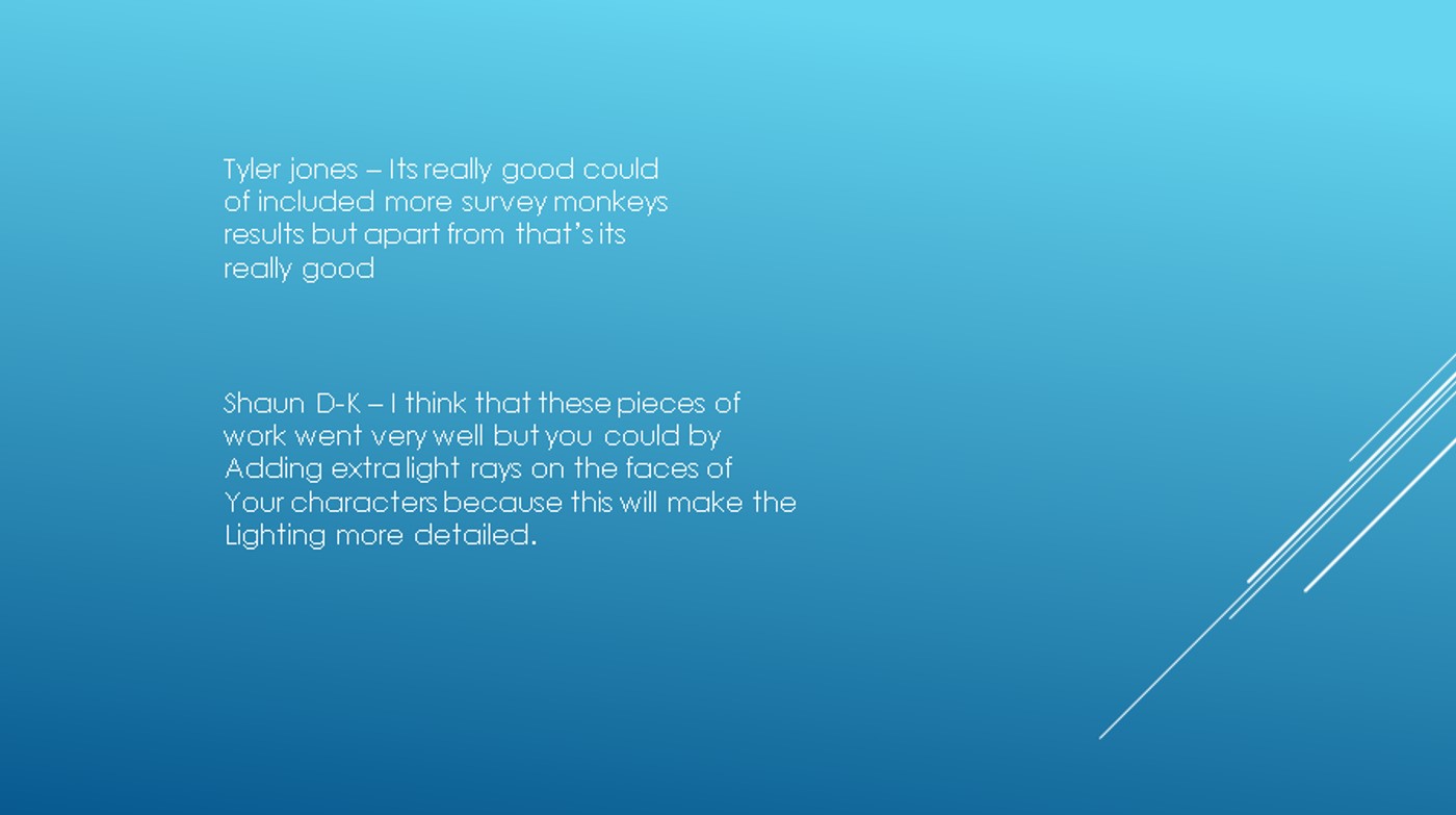
My PowerPoint presentation went well because I showed most of my work and how I produced it also my research, I had a loud and clear voice for the camera so other viewers can hear it properly.I have feedback on my PowerPoint presentations.


