Thursday, 12 May 2016

Creation of Villain game cover


Creation of villain Xbox one game cover

Firstly I added one the game template and the games description which was in white, also I added the age rating on, and small logo,  then I added an image of a city scape that I took from my camera, but I wanted to darken the image because I wanted it to look evil and scary.


          So I went onto filter - filter gallery this option me me choose which palette I wanted for my                  background


                              I on the palette menu I chose the photocopy, texture, because This gave an outline of the city in white which looks professional, and makes every single building and detail stand out.

I then added another image that I took of buildings and gave it the same effect (photocopy) I added that ti the back of the cover.


Furthermore I added black skys to it from using the rectangle tool and filling it in black also I used the paint brush tool and changed the colour to black and opacity to 40% and fill to 40% to blend the darkness of the skys with the buildings together, I also added some darkness below the description of the game so the description stands out.


I then added the title 'Soulkeeper' I placed it on the black sky to make it stand out


I changed the colour of it to grey so it suits the dark setting, I added an outer glow which was white this is so it is eye-catching and glows.


When creating the moon I used the ellipse tool to create a white circle on a black background.


I added bevel and emboss to the circle which gave it a 3D effect, I also added contour and  texture which was from photoshops own selection, the texture looks realistic and gives realism to the circle, I added inner glow and inner shadows to give it a small shadow on the outline. Also I added outer glow to make it look like there is light coming from the moon.


After that I added the moon on the side of the image so it looks like the moon is shining over the dark city.


 I then added the title again onto the side of the game cover and I added 'Londons last stand' to finish the description I done this in white too , then I added my evil character on the front cover.


I then added an outer glow on the evil character to make him stand out, and blend in with the front cover,


This is my finalized game cover, I believe everything went successful because all the colours match the evil theme, such as the title which matches the grey on the characters mask, and the black and white theme.


Wednesday, 11 May 2016

Creation of hero game cover

How I created the first game cover,

http://i.imgur.com/hLiy1Do.png

I got a template for an xbox one game online, because My games are going to be on this platform.


Secondly I added an image I took from my camera for the background image for my game, I wanted to a city scape, to make my game look like an action/type, because many games have buildings in them therefore I added an image of my own.


After that I chose filter - then gallery, And I chose the poster edges filter and adjusted the settings on it for my liking,


This is what it looked like after I changed the settings.


I then added another image I took from my camera, to the other back of the game cover, these two buildings are very well-known in London therefore I added them because my game is going to be based in London aswell., I added the same filter on filter-gallery so it doesnt look odd.


When I added the second Image on, I also added two lens flares on my game cover, One on the front and one on the back for more realism.


Furthermore I added the hero on the front of the cover, because this game cover is for the hero.


I added a description about my game onto the back for viewers to see, this description gives the viewers a slight detail of what my game is based on, Also I blurred the bottom of the image on the back so the text stands out


I chose these effects to make the text eye-catching and I chose the colour white so its simple and easy to read.


I then added my title which is 'Soulkeeper' it stands out and is connected to the description of the game, when you read the description you will know why the title is called ''Soulkeeper''

The effects I added onto the title was bevel and emboss to give it some 3d look, and colour overlay, and I made it navy so its the same colour as the helmet on the character.


To create the logo of the company who made the game I first used the ellipse tool and created one circle and one oval


I then changed the colour of the oval to white and placed it on-top of the black circle


I added these effects to it, I made it grey with some texture from Photoshop to give it a distinct look and make it stand out.


I then added the title of the game to the side of the cover, and I added ''text to the logo of the company which was ''br'' and I also added studios, this is the name I gave to the company.


I then added a 16+ logo to the game because that Is the target audience of my game, and I added ''Londons last stand'' as a subheading to finilaze the description and give small detail of what the description is going to be based on


This is what the finished cover looks like, I believe everything went successful, Because the character stands out and the city-scape is eye-catching with the poster edges filter on it, the title is the same colour as the helmet this is so it fits the theme and is not odd.


Tuesday, 10 May 2016

Survey Monkey Results


Survey Monkey results


 Almost 100% of responses from my survey got this question correct, this was to see how popular Call of Duty series are, because my game cover is going to have some battle/war features on it. My game is going to be popular because games similar have many attention.
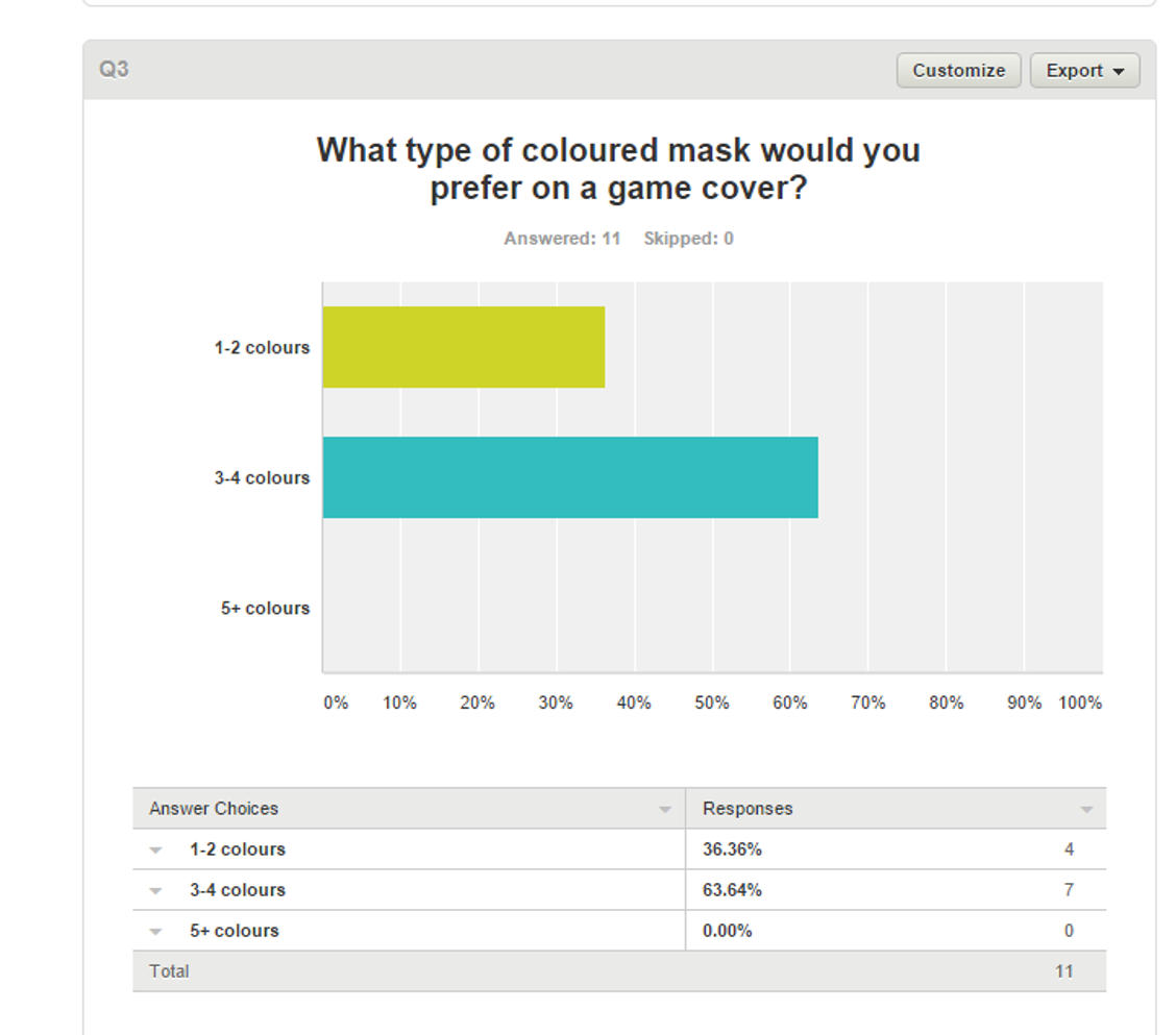
 63.64% of responses from my survey preffered That the characters masks should have 3-4 colours on it therefore I added that many colours to make the masks stand out and and give them more detail instead of having a few selection of colours.


54.55% of responses preferred a half face mask, whilst the other 45.45% preferred a full face mask, therefore for the hero I added a half face mask and for the villain I added  make a full face mask for - scary effects.

 Over 80% of responses chose dark with some light therefore for the villains cove rI added dark with some light and for the hero character I made the background  bright and sunny.
From my results from question six I  got  45.45% of people stating that I should have the hero on the front cover and another 54.55% stating that I should have the villian On the front cover, since I'm doing two game covers and a poster I made one game cover with the villain  and the other game cover with the hero on.
All responses 100% chose I should have a city scape therefore I addeda city scape for both of my backgrounds I Made one of them look dark with some light and the other cover background  bright and sunny which will be the hero.

In conclusion I believe Survey Monkeys results have helped me choose what designs were suitable for my game covers and poster, without the help of other peoples opinions It would've been hard for me to decide what to put on my game covers and poster.

Thursday, 5 May 2016

Villian character creation


Firstly I traced the image I drew on paper using Adobe illustrator and the graphics tablets provided by Ncn Adams, I didnt change my design


The two tools I used was the brush tool and the eraser


This is what the finished sketch looked like. I opened the file in photoshop. to start editing it

  I then added red onto another layer by using the paint bucket tool, of the mask because I wanted that part of the mask to be brighter, so the villain looks more demonic.


Moreover I added these effects onto it to give the mask detail and shadows, which gave it realism.
and shadows made it look authentic because with no shadows it looked plain and dull


Thats how I got the grunge red colour onto the mask and it made it look professional,


I then I then added a dark metal texture from Photoshops own textures to the front of the mask and then added effects on it

the affects I added was Bevel and emboss to give it smooth lines , inner shadows to make it look more detailed and to make the light come from the bottom, inner glow to give it a white border and color overlay to darken the texture.

After I added a different texture to the front and sides of the mask, the texture was metal grunge. I darkened them.


 I then selected the layers on the eyes, and added a black color to it because the darker the eyes the scarier the mask looks.


I then added these effects on to the mask for a more detailed look and for the lighting to look like its coming from the bottom


The effects made the eyes look professional and gave it a white shadow. Around them which gave the mask more detail and sharpness.


In addition, I colored the middle of the eyes black and added bevel and emboss to it. For a mysterious look


After I started to design the head, I firstly selected a color to experiment the effects on.


The effects I added was bevel and emboss, inner shadow, color overlay, outer glow this gave some white shadows to the head and made it look smoother,


    However I added the same texture from the sides and front of the mask to the head part but I lightened the texture on the head. so it looked a little different.


Furthermore I colored the neck in black and gave it highlights, and bevel and emboss, also I gave it shadows so it looks like the light is coming from the bottom


This is my final design for the villain, I believe this went successful, because I managed to make my character look scary, also the red on the characters mask stands out because its the only bright colour, the colour red also connotes danger which shows that this character is dangerous.

The lighting went well because it looks like the light is coming from the bottom. also the shading makes it look realistic.

What I would do to improve this character is to maybe add some texture to the neck.