Thursday 28 April 2016

Story research (back of the games)

                         
                   Description from other games to get ideas for my description on my cover.


This game description is from the game ''The Division'' It has a main title on the back which says ''When society falls, we rise. This gives a small detail of what the description and game is going to be about, then it states how the game is set in new york city and how the society has collapsed. This is acceptable to get ideas from because my game is going to be set in London.


This game description is from the game, Assassins Creed Syndicate, This quotes in capitals on the back '' Opression has to end'' This gives us small detail on what the description is going to be about, Then it states what era the game is set and which character you play as and who you fight and why, This is s the mission is and who you will be fighting and why.


This game description is from the game, Homefront The Revolution, on the back it gives us a city and a date, also it says '' America is on its knees'' This sounds like there has been something important happening in America, and gies us a sense of what the description is about, In the description it tells us how we have to fight to reclaim our city, This is a good idea to add something like this onto my game, such as the city or date.

Wednesday 27 April 2016

Sketches


This is my sketch for the Villain character, I believe this mask is an idea sketch of what its going to look like, the mask looks evil and demonic which is suitable for the evil character, Furthermore Im going to use mainly 3-4 colours on it when editing mainly black white, grey or red This is because from my Survey monkey 66% percent wanted me to use that many colours.


This is my other sketch for the Hero character, The mask looks suitable for the character because it  covers half of his face which would make it easy to see the characters eyes. for this one I will also be using 3-4 colours but the colours i'm going to use aren't going to be that dark, because he is a good character so I believe it should have some brightness to it.Unlike the evil character which is Dark and mysterious.


Tuesday 26 April 2016

Hero (good character mask)


The reason for my two characters having masks is to not show the emotions they are going through,if the characters didn't wear a mask we would be able to see their facial expressions when they are in pain, also they could have combat to the face and there would be scars/cuts across the face this could make the game from a 16+ to an 18+  that is the main reason why I'm making my characters have masks. because my games target audience is teenagers aged 16+


                                                        Masks for Hero character

                                    
This is my first idea for my characters mask, I believe this masks design is structured such as the curved edges and sharp lines, it has two holes filled with a net on the side this is to make it easier for the character to breath and reduce condensation.


This was my second idea I liked the design on it but what I disliked was how big the mask looked and there was no sharpness to it unlike my first mask, Furthermore the bones arent structured they are all different size which makes it look unprofessional.


http://www.fanrek.com/media/catalog/product/cache/1/image/29b82db22504fb0479cf1248d4fc542c/m/o/mortal_kombat_x_cosplay_sub_zero_mask2.jpg

I have chosen my first Idea mask because it isn't too big and it fits the face structure perfectly I like the outline of the mask and the design, What I would change about the mask is the two circle holes on the side I would add something else there such as a square shaped net for easier breathing.


Research into Characters (Marvel)


                                                            Research Into Marvel books

                             Michael Stratczynki, J (2007). Thor vol 3. Us: Marvel.


For my research I looked into Marvel books such as this one which is called ''Thor'' this is to get ideas from the different characters and to see how their masks and identity could help me with my final design. And what colours are mostly used within the masks


                                                                    Character : Iron Man

This characters identity looks very mysterious due to his metal covered suit , The suit has two colors red and gold this is is eye catching because it has simple colours on it and its not too vibrant, I would want my characters identity to have two or maybe three colours on it. The mask looks detailed has  a simple yet effective design, 


                                                           Character : The Destroyer

This characters suit is completely metallic and shiny, I like how the mask looks because the metal gives it many tones, textures and lighting effects, also the mask includes a helmet from protection of combat. The spikes make the character look invincible.


                                                                  Character : Dr Doom

This characters face/mask looks cryptic due to the facial expression of the mask, the design looks like its made out of strong steel, the cape covers the top part of the characters head which makes the character look mystifying,


                                     Miller, M (2005). The Ultimates Vol 2. Us: Marvel
              
This was the second book I researched into other characters


This characters mask looks simple because it is a half face mask, which is satisfying to the viewers because you can see the bottom half of his face which means hes hidden but not 100% hidden so the viewers can guess what the character looks like,  it has only used one colour which is red, this colour is basic but yet effective and eye-catching. I would want my hero characters to have a half face mask so they reveal a little identity.

Monday 25 April 2016

Mask research (evil character)


Mask research (evil character)

The reason for my two characters having masks is to not show the emotions they are going through,if the characters didn't wear a mask we would be able to see their facial expressions when they are in pain, also they could have combat to the face and there would be scars/cuts across the face this could make the game from a 16+ to an 18+  that is the main reason why I'm making my characters have masks. because my games target audience is teenagers aged 16+ it is for any sex and for people with any income, the game isnt going to be too expensive it is going to be affordable for everyone.


This image includes a thin shape for the face which is ideal for the evil character because it makes it look non human and devilish, it is in black which means it is dark and scary, I believe it is a good idea to make the mask a dark contrast because it looks more mysterious. In addition it has got a smiling face design but it looks like an evil smiling face, this could remind people of a grim reaper or the joker from batman who also has a smiling face. It is a basic yet powerful design. I would want my mask to be like that also.


https://lh3.googleusercontent.com/Ft_ktRXM3NSTQvCWbOFEvISfVKgqXWGYV4E1Yl0zFwwI22kp_lyhvdV84jb7TfioPrhB4Q=s170


This mask looks like it has some wear and tear which is creepy to the viewers it means they have been through serious situations such as war or combat it has  got black, white and red on which is 3 colours I believe 3 colours should be the maximum colours used because you dont want the mask to be too vibrant. The black and white on this mask has been balanced equally the red is not used a lot which makes the mask scarier and has a blood effect.  The shape of the mask looks like a thin face this is because you can see the cheekbones clearly which adds a demonic look to it.


https://blogger.googleusercontent.com/img/b/R29vZ2xl/AVvXsEgxWffg9p3aLiHQrKyiTMV449Jv6RtwxM9jemnQbZhlHkmThUWOV6PFMGWsYgIhO0EllwT_ZT8bJjsfnUXtG7sz1v464lJrTTwNMu0upwpMcLIOV-7McYre0eNk3bdIlYMIQB8pHjXQo0PQ/s1600/army+of+two+airsoft+paintball+bb+gun+rios+mask+40th+days+Commando.jpg
This mask also uses the same colors black, white and red I believe the black makes it mysterious and the white gives it a skeleton, wear/tear look, also the red used has a bloody effect which can be horrifc and make it easier to know that this mask is evil because the colour red connotes blood and danger. I believe the design all together fits the criteria for an evil looking mask.


The mask I have chosen to persue is this one I believe the shape of it is perfect for an evil character, I will just be using the shape and maybe changing some of it, I will be definitely changing the design to my own, I will be using 2-3 colours on it to make it eye catching for the viewers.


Contact sheets


Contact sheet


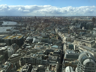
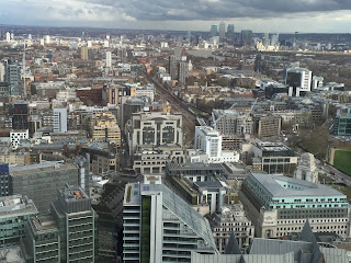
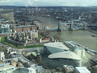
For all these images I visited the 'Sky Garden' building in central London, most of the photos was taken with an ISO of 100 this is so the images can be seen as sharp and not too bright. However the images that I used a 200 ISO was much brighter and these images are IMG_4930.JPG, IMG_4931.JPG and IMG_932.JPG , The higher ISO made the images look too bright and unnapealing unlike the rest. Furthermore the IMG_4927.JPG was blurry because it was taken during movement.


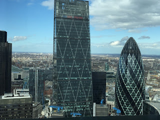
All these images where took with an ISO of 100 that is why the colors on it are not too dark and not too bright they are just right, The aperture that I used on all these photos were F16 this is so photos had a deep depth of field therefore it made photos distinct in detail. Also I used a 1/60 shutter-speed when taking these photos to make it look clear since there was no movement in the photos.


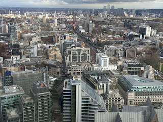
All the images include an ISO of 100 which made them detailed, except for IMG_4958.JP, IMG_4959.JPG and IMG_4962.JPG which used an ISO of 200 this was because it was getting late and the atmosphere was getting darker and I needed a brighter image, I still used the same aperture of F16 for a clear shot.


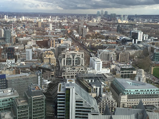
All these images Used an ISO of 200 I used an ISO of 300 for IMG_4976.JPG this is because it started to get dark , Furthermore I used a shuter-speed of 1/60  again because there was no movement. the final two images IMG_4996.JPG and IMG_4998.JPG was taken from inside this is because I wasnt able to get onto the balcony, therefore them images are not likely going to be used for my final background.


Thursday 21 April 2016

Primary research


Primary game research Images took from GAME


                                                            Assassins Creed : Syndicate
                                       Created by : Ubisoft - Release date, October 23, 2015

This game cover represents a hero which is the person in the middle , The character looks mysterious and you cant see all of his face, this gives the character a special look because we can tell that he is a hero yet we cant tell what he exactly looks like due to his costume covering up his face. So for my character I might show half of his face to make him look mysterious. Ubisoft is a large company that create many games, they are well known for there Hd graphics on popular games.


Fallout 4
Created by : Bethesda Softworks - Release date, November 10, 2015

This game cover is suitable for my research and for ideas because it shows a hero wearing a full face mask which is very mystifying and dark the person inside it looks hidden and it also has many designs on the mask which I could add on to my character when creating a mask for him. Bethesda is an American game publisher well known for producing popular games such as Elder Scrolls V.


Star wars : Battlefront
Created by : Dice, LucasFilm, and EA sports, release date -November 17, 2015

This game cover is suitable for background wallpaper because it shows a wide-shot view of a scene that has happend and it gives the audience a taste of what the games going to look like and what the scenery is going to look like throughout the game. Also the title is in the middle of the cover which is suitable because it stands out and is eye-level. The text stands out from the blue background. Activision is well known for their game franchises such as Call Of Duty, they are the worlds first independent game developer.


                                                    Tom Clancys : The Division
                                               Created by: Ubisoft , release date - March 16, 2016

This game shows three characters that are walking towards big buildings which looks misty, therefore for my background I'm going to add buildings as well because it looks eye-catching to the viewers and its vibrant. Furthermore the title is at the top this stands out from the white background, the colour also stands out because thats the only vibrant colour used on the cover.

FMP schedule


My schedule for FMP


Tuesday 19 April 2016

Proposal (520) words


                                                                          Proposal

For my final major project I have chosen to make 3 video game covers and logo based on action games because I believe it is original and it will be a successful task by using my photography and designing skills, For my primary research I'm going to make a survey monkey so I can get the public's opinions on the survey and I will be asking questions about their favorite genre such as , I will be asking questions such as ''Which layout do you prefer' this will help me with my game because I will know which layouts are more preferred to the public eye ,also I will be getting additional design help for my game.

For my other research I'm going to go into different shops that sell video games such as 'Game' and I will be looking around and taking photos of the different games that are eye catching also I will be getting ideas from the games I have chosen. This will help me out a lot because I'm going to make everything for the game such as the Logos and different texts, slogans, and titles for my cover. My strong points are photography and design that is why I have chosen this idea, it is a mixture of both. I also enjoy playing games.

Furthermore for my Secondary research I will be going on the internet to look at different games that are produced and I will get ideas from them by looking at what images are added and why.

My initial ideas would be looking at websites for the games and seeing what different font styles are used, also what images are used. I want my cover to have 2 different characters and the backgrounds to be buildings which I will edit them and make them look like they are part of my game. This will all be created and designed by me.

I will also be adding an evil character and a good character in my game and because it is going to be an action game I'm going to make them both have masks but the evil character is going to have a full face scary mask and the good character is going to have a half face mask because he is hiding from his enemy's and doesn't want all his face being seen. For this I will be looking at different mask types on the internet to get ideas from them and to see what shape of the mask is suitable for each character an. Also what style should be on the mask for both of the characters and what colors . My target audience for my game covers is going to be for both genders aged 16 and over because this game is a mature action game which is suitable for my age range and other mature audience.

I believe this Idea is going to be successful because I am creating the characters by scratch and the idea is completely original and I'm working on it myself, all the designing and background photography is going to be produced by me.

Sketch/Idea test


Test/sketch idea

This is one sketch that I created using Adobe Illustrator, I sketched from a game called Tom Clancys:
The Division I believe by coloring in and shading and adding different textures would make this sketch look realistic and eye-catching

I was also thinking of adding a background a swell for it.


http://static2.cdn.ubi.com/ncsa/TCTD/website/og/TCTD_home_og-image_1200x628.jpg

Brainstorm Ideas


Brainstorm ideas


These are all my ideas for my final major project the final 3 that stand out the most are video game covers, Tshirt design and festival poster design I believe the one that I'm going to most likely do is video game covers and a poster, for this I would get ideas and research from other games and see how they are designed  and create 2-3 different different game covers using photography and design using Photoshop, Adobe Illustrator and Graphic Tablets which the college provides us with.

The game covers platform Im going to do for is ( Xbox One)

Wednesday 6 April 2016