Wednesday, 4 May 2016
Character names
Evil character name
Crimson soulkeeper
I chose this name for my evil character, because the name has a deep meaning to it that suits my evil characters appearance, personality and motive, also Soulkeeper comes across scary and shows that it is a given nickname from doing evil activities.
Hero character name
Brave gloom
I have chosen this name because my character is going to be brave because he is on his own and he is taking over evil. furthermore gloom means darkness and my character is going to have some darkness to him because hes going to take over evil. and he will need to have balanced emotions in order to do this.
Description:
London city has turned into a crisis zone, it has been taken over by the Soul-keeper's.You are Brave Gloom who is the only agent left to fight back, will you defeat them? or will the crisis never end.

Tuesday, 3 May 2016
Hero character creation


This is what the final design looked like after I finished tracing and changing it.

I copied the villain onto photoshop to start adding colours/textures and designs/ shadows to give life to the character and make him look realistic.

When editing the mask I added any colour to the area I wanted the texture on this is mandatory if you want to add a texture.

Furthermore I made a layer with the texture and by pressing CTRL + ALT and clicking in-between the two layers I managed to add the texture onto the colored area. I added a mesh texture this is to make the character breath easier

After that I added some colour onto the mask (any colour)

Then I added some Bevel and emboss to my chosen colour and I also added inner shadows onto it on the layer style so it looks professional and sharp for when I add texture to it

I done the same process when I added the mesh which was pressing CTRL + ALT and clicking in between the two layers, ( the texture layer and the layer I want the texture to be on)

This is how I created the texture onto the mask side of the mask and a little bit on the front which covers the nose

For the middle section I done the same thing by adding the same texture (grunge) but changing the colour of it to silver and adding inner shadows to make it look darker.


I then added bevel and emboss and inner shadows to make the helmet look smooth and sharp and to give it a metallic look,

In addition I added a neck onto the character by using the Line tool and warping it so it looks curved

I then added a texture onto the neck (this texture was from Photoshops own selection ) I added this to give it a fabric look I also added a stroke effect so the lines on the neck was thicker.

Moreover I added two blue eyes which I created in Illustrator I added them onto the character, to make them stand out when your looking him.


I also used the ellipse tool to create the two circle white dots in the middle of the eyes for more realism


Furthermore I edited the skin colour layer and I added effects onto it

I used bevel and emboss , also I added one of photo shops stock textures to give it a skin look and so its not smooth all the way around, I added some stroke and inner shadows to make it look realistic.

I then went onto Adobe illustrator to draw eyebrows onto my character I sketched them from an image i made it similar to the image.

I then copied the eyebrows I drew onto photo-shop and I filled the colour to extremely dark grey and I used the eraser tool to add skin effects effects onto it by choosing an erasor that looks like hair particles

That made the eyebrows look realistic I then used a normal eraser to fade some bits of the eyebrow onto the skin. as you can see.

This is my final design for the hero character I believe everything went well , all the colours and shadows make my character have realism, the light coming from the left made it look professional because if the image didn't have shadows it wouldn't look as genuine.
To improve my character I could add some texture onto the hat but altogether my final design went successful.

Thursday, 28 April 2016
Story research (back of the games)

This game description is from the game ''The Division'' It has a main title on the back which says ''When society falls, we rise. This gives a small detail of what the description and game is going to be about, then it states how the game is set in new york city and how the society has collapsed. This is acceptable to get ideas from because my game is going to be set in London.

This game description is from the game, Assassins Creed Syndicate, This quotes in capitals on the back '' Opression has to end'' This gives us small detail on what the description is going to be about, Then it states what era the game is set and which character you play as and who you fight and why, This is s the mission is and who you will be fighting and why.

This game description is from the game, Homefront The Revolution, on the back it gives us a city and a date, also it says '' America is on its knees'' This sounds like there has been something important happening in America, and gies us a sense of what the description is about, In the description it tells us how we have to fight to reclaim our city, This is a good idea to add something like this onto my game, such as the city or date.
Wednesday, 27 April 2016
Sketches


This is my other sketch for the Hero character, The mask looks suitable for the character because it covers half of his face which would make it easy to see the characters eyes. for this one I will also be using 3-4 colours but the colours i'm going to use aren't going to be that dark, because he is a good character so I believe it should have some brightness to it.Unlike the evil character which is Dark and mysterious.
Tuesday, 26 April 2016
Hero (good character mask)
Masks for Hero character

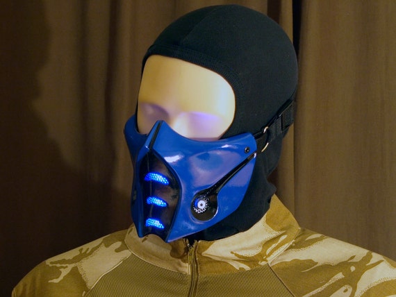
This is my first idea for my characters mask, I believe this masks design is structured such as the curved edges and sharp lines, it has two holes filled with a net on the side this is to make it easier for the character to breath and reduce condensation.


This was my second idea I liked the design on it but what I disliked was how big the mask looked and there was no sharpness to it unlike my first mask, Furthermore the bones arent structured they are all different size which makes it look unprofessional.

http://www.fanrek.com/media/catalog/product/cache/1/image/29b82db22504fb0479cf1248d4fc542c/m/o/mortal_kombat_x_cosplay_sub_zero_mask2.jpg

I have chosen my first Idea mask because it isn't too big and it fits the face structure perfectly I like the outline of the mask and the design, What I would change about the mask is the two circle holes on the side I would add something else there such as a square shaped net for easier breathing.
Research into Characters (Marvel)
Michael Stratczynki, J (2007). Thor vol 3. Us: Marvel.

For my research I looked into Marvel books such as this one which is called ''Thor'' this is to get ideas from the different characters and to see how their masks and identity could help me with my final design. And what colours are mostly used within the masks

Character : Iron Man
This characters identity looks very mysterious due to his metal covered suit , The suit has two colors red and gold this is is eye catching because it has simple colours on it and its not too vibrant, I would want my characters identity to have two or maybe three colours on it. The mask looks detailed has a simple yet effective design,

Character : The Destroyer
This characters suit is completely metallic and shiny, I like how the mask looks because the metal gives it many tones, textures and lighting effects, also the mask includes a helmet from protection of combat. The spikes make the character look invincible.

Character : Dr Doom
This characters face/mask looks cryptic due to the facial expression of the mask, the design looks like its made out of strong steel, the cape covers the top part of the characters head which makes the character look mystifying,
Miller, M (2005). The Ultimates Vol 2. Us: Marvel

This was the second book I researched into other characters

This characters mask looks simple because it is a half face mask, which is satisfying to the viewers because you can see the bottom half of his face which means hes hidden but not 100% hidden so the viewers can guess what the character looks like, it has only used one colour which is red, this colour is basic but yet effective and eye-catching. I would want my hero characters to have a half face mask so they reveal a little identity.
Monday, 25 April 2016
Mask research (evil character)
The reason for my two characters having masks is to not show the emotions they are going through,if the characters didn't wear a mask we would be able to see their facial expressions when they are in pain, also they could have combat to the face and there would be scars/cuts across the face this could make the game from a 16+ to an 18+ that is the main reason why I'm making my characters have masks. because my games target audience is teenagers aged 16+ it is for any sex and for people with any income, the game isnt going to be too expensive it is going to be affordable for everyone.


This image includes a thin shape for the face which is ideal for the evil character because it makes it look non human and devilish, it is in black which means it is dark and scary, I believe it is a good idea to make the mask a dark contrast because it looks more mysterious. In addition it has got a smiling face design but it looks like an evil smiling face, this could remind people of a grim reaper or the joker from batman who also has a smiling face. It is a basic yet powerful design. I would want my mask to be like that also.

This mask looks like it has some wear and tear which is creepy to the viewers it means they have been through serious situations such as war or combat it has got black, white and red on which is 3 colours I believe 3 colours should be the maximum colours used because you dont want the mask to be too vibrant. The black and white on this mask has been balanced equally the red is not used a lot which makes the mask scarier and has a blood effect. The shape of the mask looks like a thin face this is because you can see the cheekbones clearly which adds a demonic look to it.

https://blogger.googleusercontent.com/img/b/R29vZ2xl/AVvXsEgxWffg9p3aLiHQrKyiTMV449Jv6RtwxM9jemnQbZhlHkmThUWOV6PFMGWsYgIhO0EllwT_ZT8bJjsfnUXtG7sz1v464lJrTTwNMu0upwpMcLIOV-7McYre0eNk3bdIlYMIQB8pHjXQo0PQ/s1600/army+of+two+airsoft+paintball+bb+gun+rios+mask+40th+days+Commando.jpg

This mask also uses the same colors black, white and red I believe the black makes it mysterious and the white gives it a skeleton, wear/tear look, also the red used has a bloody effect which can be horrifc and make it easier to know that this mask is evil because the colour red connotes blood and danger. I believe the design all together fits the criteria for an evil looking mask.
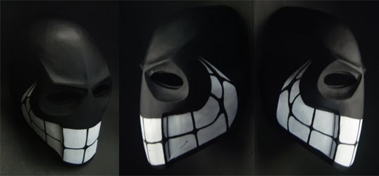
The mask I have chosen to persue is this one I believe the shape of it is perfect for an evil character, I will just be using the shape and maybe changing some of it, I will be definitely changing the design to my own, I will be using 2-3 colours on it to make it eye catching for the viewers.
Subscribe to:
Posts (Atom)